When it comes to home decor, wall color is more than just a backdrop — it’s a powerful tool that shapes how we feel, how we live, and even how we behave. The psychology of color has been studied for decades, and interior designers have long known that the hues you surround yourself with have the potential to elevate your mood, calm your nerves, or spark creativity.
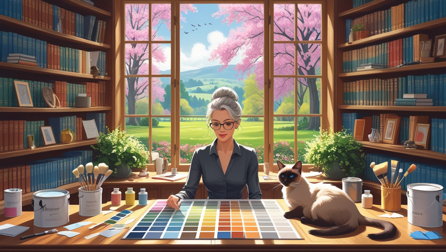
At The Painted Nest™, we believe your home should not only look beautiful — it should feel like a sanctuary. Choosing the right wall color can help you create a space that’s both stylish and soul-soothing.
Why Color Psychology Matters in Interior Design
Color psychology explores how different shades affect human emotion and behavior. Certain colors can stimulate energy and conversation, while others can evoke rest and relaxation. This matters when decorating a home, because different rooms have different purposes.
For instance, you might want a serene shade for your bedroom, but a vibrant one for your kitchen or home office. Understanding how colors influence the mind helps you design intentionally.
“Color is the place where our brain and the universe meet.”
– Paul Klee
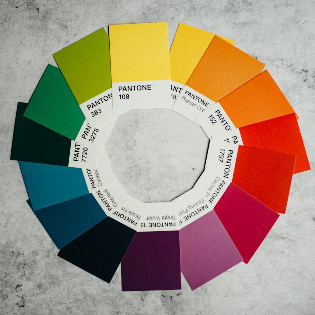
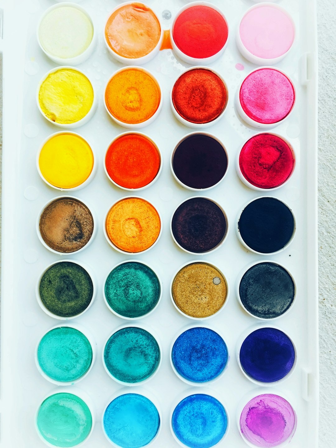
Common Color Associations
Here’s a breakdown of how common colors tend to be perceived psychologically:
- Blue: Calm, trustworthy, peaceful. Ideal for bedrooms, bathrooms, and meditation spaces.
- Green: Balanced, refreshing, connected to nature. Works well in almost any room.
- Yellow: Cheerful, energizing, sunny. Best for kitchens, breakfast nooks, or creative areas.
- Red: Passionate, stimulating, warm. Great for dining rooms or accent walls.
- Gray: Sophisticated, neutral, calming. A versatile choice for modern interiors.
- White: Clean, pure, open. Ideal for making small rooms feel larger.
- Black: Dramatic, elegant, grounding. Use carefully — best in accents or small spaces with plenty of light.
How to Choose the Right Wall Color for Your Interior
Now that you understand the emotional language of color, let’s explore how to choose the right one for your space.
“Color is a power which directly influences the soul.”
– Wassily Kandinsky
1. Start with the Mood You Want to Create
Ask yourself: How do I want to feel when I walk into this room?
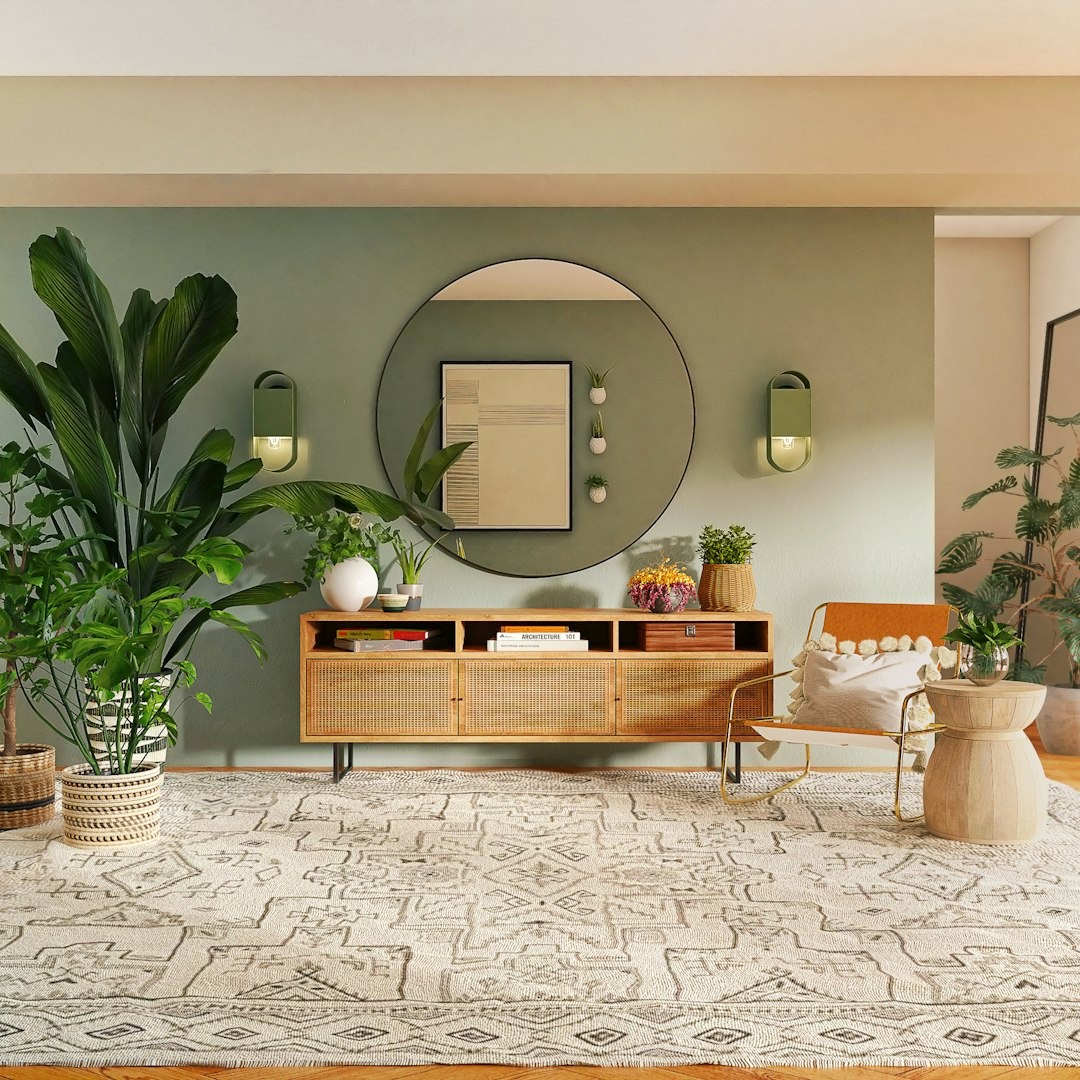
If you’re decorating a bedroom and want it to feel restful, a cool tone like soft blue, sage green, or muted lavender might be perfect. For a social living room, consider warmer neutrals like creamy beige or terracotta.
The goal is to align the color’s psychological effect with the room’s purpose.
“I found I could say things with color and shapes that I couldn’t say any other way—things I had no words for.”
– Georgia O’Keeffe
2. Consider Natural Lighting
Lighting changes everything. A color that looks cozy in natural morning light can appear stark under overhead lighting at night. Rooms facing north get cooler light, so warm colors can help balance that. South-facing rooms are flooded with sunlight, making almost any color glow.
Tip: Always test swatches on your wall and observe them at different times of day.
“Color is a matter of taste and of sensitivity.”
– Edouard Manet
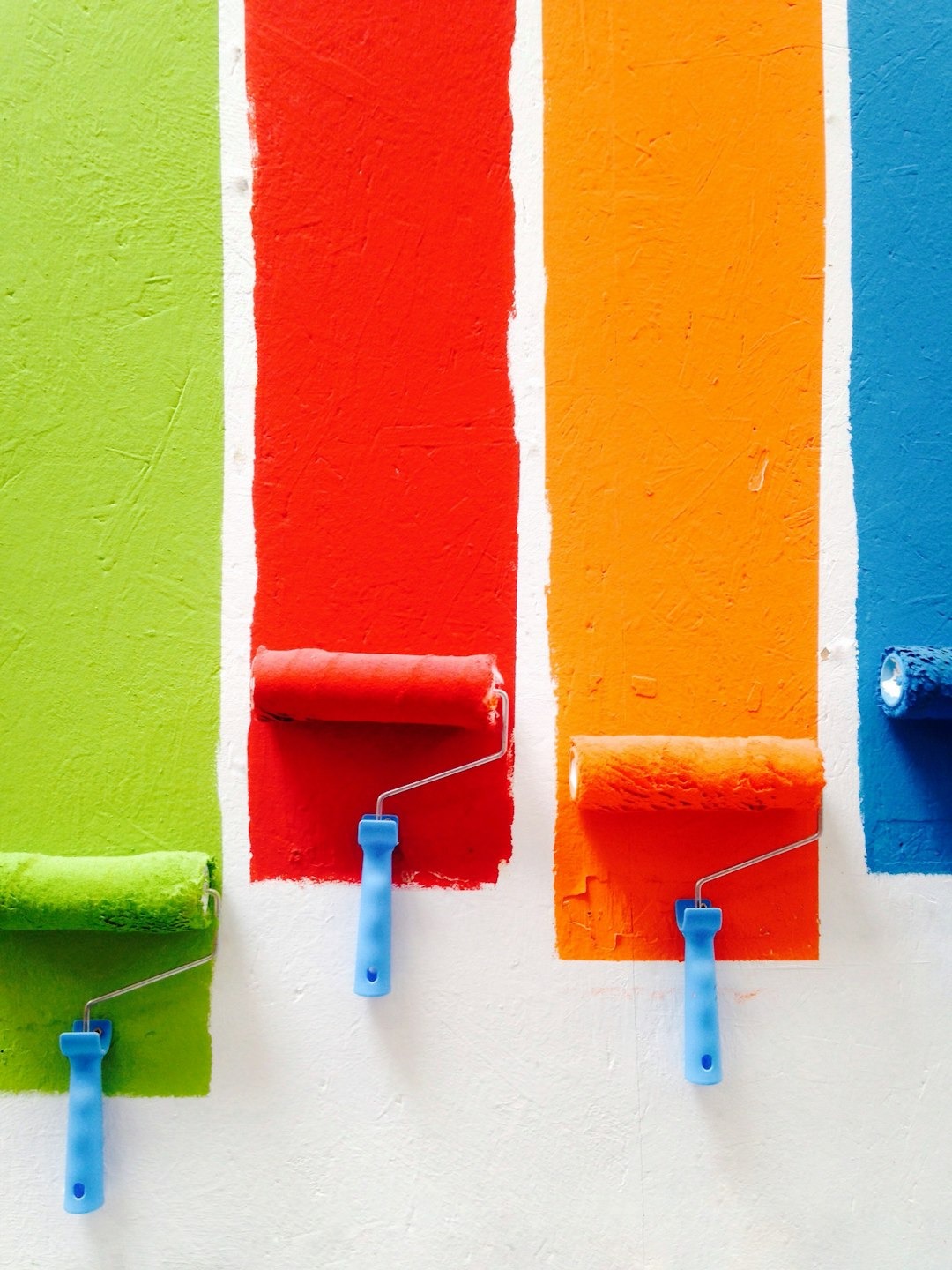
3. Use the 60-30-10 Rule
Designers often follow the 60-30-10 rule to create visual harmony:
- 60% dominant color (usually walls)
- 30% secondary color (furniture/upholstery)
- 10% accent color (decor or art)
Wall color is usually the dominant color, so choose something versatile that allows you to build layers around it.
4. Create a Flow from Room to Room
While each room can have its own personality, it’s important to create a visual connection as you move throughout your home. Using complementary tones or variations of the same hue (e.g., a deep navy in the dining room and a powder blue in the hallway) can make your home feel cohesive.
“Colors, like features, follow the changes of the emotions.”
– Pablo Picasso
5. Don’t Be Afraid of Neutrals — or of Color
Neutrals are a designer’s best friend for a reason: they provide a timeless canvas and pair well with nearly everything. But don’t underestimate the impact of a bold statement wall or a moody powder room. A rich jewel tone can make a small space feel intentional and luxurious.
If you’re hesitant, start with one room or one wall. Color can always be added gradually.
“Color helps to express light—not the physical phenomenon, but the only light that really exists, that in the artist’s brain.”
– Henri Matisse
Final Thoughts
At The Painted Nest™, we believe in decorating with heart. The colors you choose speak volumes — not just about your style, but about the life you want to live inside your home. Whether you gravitate toward quiet earth tones, breezy coastal hues, or vibrant colors that spark joy, trust your instincts and let your home tell your story.
Before you pick up a paintbrush, take a moment to consider how you want to feel. That’s where true design begins.
Footnotes
- S. Birren, Color Psychology and Color Therapy, McGraw-Hill, 1950.
- Angela Wright, The Beginner’s Guide to Colour Psychology, Colour Affects, 2014.
- Kuller, R., Ballal, S., Laike, T., Mikellides, B., & Tonello, G. (2006). The impact of light and colour on psychological mood: a cross-cultural study. Ergonomics, 49(14), 1496-1507.
- Pantone Color Institute, “Color Intelligence: How Color Influences Design and Emotion,” www.pantone.com
Bibliography
- Birren, Faber. Color Psychology and Color Therapy: A Factual Study of the Influence of Color on Human Life. McGraw-Hill, 1950.
- Wright, Angela. The Beginner’s Guide to Colour Psychology. Colour Affects, 2014.
- Küller, R. et al. “The Impact of Light and Colour on Psychological Mood.” Ergonomics, vol. 49, no. 14, 2006, pp. 1496–1507.
- Pantone Color Institute. “Color Intelligence: How Color Influences Design and Emotion.” Pantone, www.pantone.com.
Hashtags
#InteriorDesignTips #ColorPsychology #HomeDecorInspiration #WallColorIdeas #ThePaintedNest #DecorWithHeart #ColorTherapy #MoodByDesign #CozyInteriors #ModernHomeStyle

Leave a Reply